Well its not that tough! I have done this using my basic knowledge of CSS only!![]() Lets see how we can do this! The main concept behind this is to make your blogger template of fluid width
Lets see how we can do this! The main concept behind this is to make your blogger template of fluid width
Process:
- Goto Layout>Edit HTML
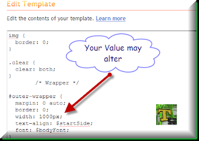
- Now scroll down until you see some thing like this [Search for Wrapper]

- Note down the current width of your blogger template and make it 100% [Or lesser value if you want]
- Now scroll down again to find the #main and #sidebar CSS. They should look some thing as given below in the image

- Note that the for main “width: 650px;” and for sidebar “width: 300px;”. As the outer wrapper was of 1000px width so in terms of percentage main width should be (650/1000)*100 = 65 % and sidebar should be 30%. So change it to their respetive values so that it ultimately looks similar to this:
#main {
width: 65%;
//Other values
}Please note that these values are for illustration only!
- Then save your template and see your blog! Also try it on different resolution from here You should notice the changes

Tip:
Want to make the main posts to leave some margin at left! Just add this style to your #main css padding: 0 10px; So that it ultimately looks like
#main {
width: 65%;
float: $startSide;
padding: 0 10px;
background-color: YOUR COLOR;
//any other CSS design of your choice
word-wrap: break-word; /* fix for long text breaking sidebar float in IE */
overflow: hidden; /* fix for long non-text content breaking IE sidebar float */
}
~~The End~~

Very useful tutorial,but unfortunately lot of people dont take the full advantage of css.
I am going to try this. It’s a good idea but the problem is I don’t want to modify my template code too much just in case it stops working fully with Blogger widgets.
Nice tutorial man…!
The look and style of your blog is awesome!
I reached here searching for tips to make my blog fluid but I spent my time playing with your page tabs. 😀